Choosing the Right Images for Your Wedding or Portrait Website

Maybe you’re putting up your very first website.
Maybe you’ve had a website for a long time and it’s in desperate need of updating.
It doesn’t matter how long you’ve been doing photography; the question of which images to put in your galleries is always a hard one. And when I say hard, I mean staring at your computer until your eyes bleed, agonizing over whether each image should stay or go and never quite sure you’re doing this right kind of hard. Am I right?
Well, there are a few things we do to help us get through that and that’s what I want to talk with you about today. Then you can use these techniques to plow through your gallery selection with great success and move on to other more important things, like eating or sleeping, which I’m sure you’ve been neglecting while agonizing over your galleries. Or is that typically just me?
Style Words*
Pick three words that describe your brand. Examples would be: “Dramatic, Edgy, Chic” or “Classic, Fun, Relaxed”.
These will be the words you run everything by. You’ll use them in the way you describe your work. The way your packaging looks will adhere to these descriptors. The clothes you choose for yourself when shooting or in your bio images will feed into this. The type of language you use in all business materials will relate back to the feel you’ve chosen in your style words. Most importantly (for purposes of this post anyway): the images you choose to represent you will fit the parameters of your style words as well.
Having style words and applying them across the board will make all the difference in how cohesive your brand appears from start to finish. So think on it and pick out your words before proceeding with any image selection.
A word of advice about choosing your style words: you want them to be authentic to you. No, they NEED to be authentic to you, or your whole brand will seem false. As photographers we are in a very personal business and our businesses are a reflection of ourselves. So choose words that fit you naturally. Those are going to be the ones you can stick with over the long haul.
Words acquired. Now what?
Ok, you’ve got your words in place and you’re ready to roll. Go through each of your favorite images from your portfolio and ask yourself, “does this image fit my style words? Is it X and X and X?”
Some images will be more of one word than another and that’s ok. We just want them to adhere to your style words as a whole.
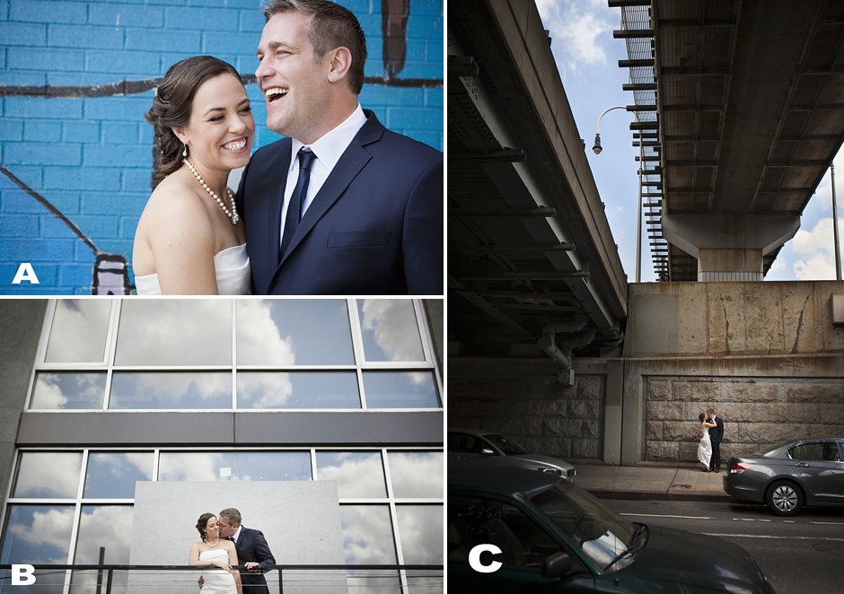
Not everything you deliver to your clients will fit your style words, but everything in your gallery should in some form or fashion. Take the images below for example. Let’s say your words are “fun, vibrant, connected”. Image A is the clear winner. Now let’s say your words are “clean, modern, timeless”. Image B belongs in your gallery. If they’re “dramatic, edgy, chic”, you should select Image C. All images were delivered to the client, but only 1 has a place in your gallery depending upon the filter you use.

Determine your gallery strategy.
Will you have favorites galleries, featured galleries of individual shoots/weddings, or both?
Personally, I like a combination of both favorites and feature galleries. Your favorites galleries give you a chance to showcase your best of the best, while your features show that you’re a well-rounded photographer who can capture everything your client is looking for.
When selecting images for your features, your style words might not apply to each image. Details are important to include, for instance, but they might not be dramatic, edgy and chic. The focus here should be on choosing features that are your strongest works, and adhere most to your style words, and the types of clients you want to attract, as a whole. If you’ve chosen your style words correctly, those two things should be one in the same.
Selecting the right number of images
This is tricky and in my humble opinion, I think the right answer here is that there isn’t one right answer.
Quality over quantity is key first and foremost.
Choose images that match your style words an that you love. Don’t fill your gallery with things that aren’t your very best just to show more work. That will hurt you rather than benefit you. If you don’t have a lot to show, that’s fine. You’ll shoot for your style words and add to your galleries over time. But a small, strong gallery is much better than a large, mediocre gallery.
Assuming you have lots of great images to choose from, consider the client you’re trying to attract.
If you feel this person would be much more concerned about the experience of being with you over the images, or if they aren’t prone to long attention spans, a more concise gallery is the way to go. Sean and I have always attracted artistic or the very detailed oriented types. These people tend to want to see lots of images so that’s what we give them. Our galleries are much more lengthy than they need to be, but it works for us.
If you really must have some sort of a number to aim for, 25-50 images per gallery seems like a nice ballpark to aim for. ;)
The clock is running; what will you show?
The final step is to decide the order of your images. Sean and I have always approached that with your average person’s browsing habits in mind, i.e. how long a person will usually stay on a page with no personal interest to draw them in.
Guess what? It’s not long.
With that in mind, if you had 3 seconds to show me your work before I moved on to another wedding photographer’s site in the loooooong list on google, what image would you show me? What image would you use to draw me in and make me stay?
That is your first image for your opening page.
If you have an opening slideshow, what would you show me if I gave you another 3 seconds? And another? And another? Build each page and gallery this way. Featured wedding galleries are the obvious exception here since you’ll be showing the day in chronological order, but this rule applies to all else.
Now your galleries are stocked with your best images and compiled in a way that draws the viewer in and makes them want to stay. It all makes a strong statement about who you are as a photographer, and is dialed in to attract your ideal clients.
Congratulations! Now you can publish now publish and get back to your life. :)
Once again, I hope you’ve found this helpful. If you would, please like or share. It helps us gauge which content is most beneficial to you so that we can create more like it.
Until next time…
— Mel
*Special thanks to our friends, Jen and Steve Bebb, for teaching us about style words many years ago so that we can share them with you!
